Brand & Visual Direction
Reach Customers Who Are Ready to Buy Right Where They Search


Reach Customers Who Are Ready to Buy Right Where They Search
Brand and visual direction define logo use, colors, typography, imagery, and style choices, creating a consistent website identity that builds recognition and trust.
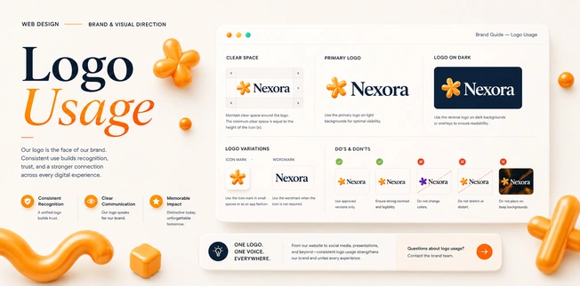
Logo usage defines how your brand mark appears across pages, including placement, spacing, sizing, background contrast, and consistency, helping visitors recognize your business quickly and trust your professional identity online.
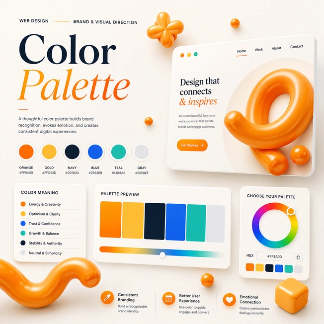
A color palette creates visual consistency, reflects brand personality, guides attention, supports readability, highlights important actions, and helps your website feel polished, memorable, trustworthy, and aligned with your audience online.
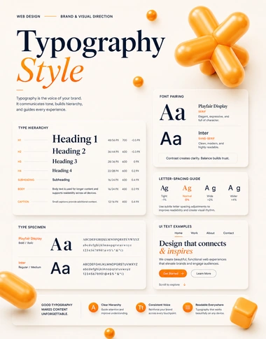
Typography style controls font choices, sizes, spacing, and hierarchy, making content easier to read, strengthening brand tone, improving page flow, and helping users understand information quickly and clearly online consistently.
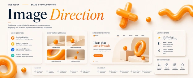
Image direction guides the style, quality, subjects, and mood of visuals, ensuring every photo, icon, and graphic supports messaging, builds trust, and creates a consistent brand experience across pages online.
An in-depth look at brand and visual direction aligns logo usage, colors, fonts, imagery, spacing, and style so every page feels consistent, memorable, professional, trustworthy.
Topic | Thought |
|---|---|
Logo Placement | Place logos consistently to strengthen recognition across every branded touchpoint. |
Clear Space | Protect space around logos so designs stay clean and professional. |
Logo Variations | Use approved logo versions for dark, light, and complex backgrounds. |
Minimum Size | Set size limits to keep logos readable across all formats. |
Brand Consistency | Apply logos uniformly to build trust and avoid visual confusion. |
Color Versions | Use correct color versions to maintain brand accuracy everywhere online. |
Incorrect Usage | Avoid stretching, rotating, recoloring, or altering logos without brand approval. |
File Formats | Select proper logo files for print, web, and social uses. |
Icon Usage | Use simplified icons when full logos need cleaner small-space applications. |
Partner Materials | Provide logo rules so partners represent your brand correctly everywhere. |
Topic | Thought |
|---|---|
Primary Colors | Define main colors that make your brand recognizable and consistent. |
Secondary Colors | Add supporting colors that create flexibility without weakening brand identity. |
Accent Colors | Use accent colors to highlight actions, offers, and important messages. |
Color Contrast | Ensure strong contrast for readability, accessibility, and better user experience. |
Brand Emotion | Choose colors that reflect the feelings your brand should create. |
Digital Colors | Set web color codes for accurate display across digital platforms. |
Print Colors | Define print color values to keep materials consistent offline. |
Background Colors | Select backgrounds that support readability and visual balance effectively. |
Button Colors | Use button colors that guide attention toward important customer actions. |
Color Rules | Document color rules so every design stays visually aligned. |
Topic | Thought |
|---|---|
Primary Font | Choose a main font that reflects your brand personality clearly. |
Secondary Font | Pair supporting fonts carefully to add hierarchy and visual interest. |
Heading Style | Design headings that guide readers and organize content clearly. |
Body Text | Keep body text readable, clean, and comfortable across all devices. |
Font Sizes | Set consistent sizes for headings, paragraphs, captions, and buttons. |
Line Spacing | Use proper spacing to improve readability and reduce visual strain. |
Font Weight | Apply weights strategically to emphasize important messages and content sections. |
Text Hierarchy | Create hierarchy so visitors scan pages faster and understand priorities. |
Web Fonts | Select reliable web fonts that load quickly and display correctly. |
Typography Rules | Document type rules to keep every brand message visually consistent. |
Topic | Thought |
|---|---|
Visual Style | Define image style so every visual supports your brand identity. |
Photo Tone | Choose photo tones that match your message, audience, and emotion. |
Image Quality | Use sharp, professional images that increase credibility and customer trust. |
Subject Focus | Select images that clearly highlight people, products, services, or outcomes. |
Brand Filters | Apply consistent filters to create a unified visual appearance. |
Composition Rules | Use balanced framing to make images clean, focused, and engaging. |
Stock Images | Choose authentic stock images that avoid generic or staged impressions. |
Custom Photography | Capture original photos that make your brand feel more personal. |
Icon Direction | Use icons that match your style, message, and visual system. |
Image Consistency | Keep imagery aligned across websites, ads, social, and print. |









Hello@marketer.com
2912 Meadowbrook Road, Los Angeles, CA 90017